Every business must be able to make informed decisions that are based on accurate and relevant data. Accumulating the right kind of data is just not enough. You should be able to interpret it properly so that you can make it work for your business. One of the ways you can do that is to use visual cues to represent the available data. These could be in the form of graphs, tables, charts, heatmaps, and so on. When complex data is broken down into simplistic forms it begins to tell the right stories for you to develop critical insights to ensure that your business stays ahead in the competitive race.
Data – Your Business Storyteller
With the vast amount of data available to businesses, it becomes important to collate the ones that make sense for you. More importantly, data becomes significant only when you realize its true potential.
Python Development service providers help your data evolve as the storyteller for your business by employing the right data visualization techniques. It helps you visualize, analyze, and monetize data in the best possible way.
Representing data in visual forms helps to ensure easier comprehension. You begin to see the narratives more explicitly and can plan your strategies in a much better way.
Building interactive data visualization is another way to further empower your business by enabling your teams to drill down into the data to explore specific details. You can also zoom out to obtain a high-level view if required. It reduces your team’s dependence on data analysts as they are now fully capable of playing around with the available data to identify trends, patterns, and scope for growth.
When represented in their visual forms, it is easier for data to provide the right indications for managing risks and vulnerabilities. You are better able to prepare strategies to mitigate these elements and build a stronger defense against any possible threats.
Using Data visualization techniques is a great way to gain a better understanding of your data and how it can propel our business forward by several miles. Having a strong partner in the form of Python as your aid in this is sure to be a big help.
Python – Building Data Stories
Python, with its vast ecosystem of libraries, highly interpreted language, readable syntax, versatility, and high adaptability is a preferred choice for your data visualization journey. Python development service providers walk with you throughout your journey to help you navigate through its nuances.

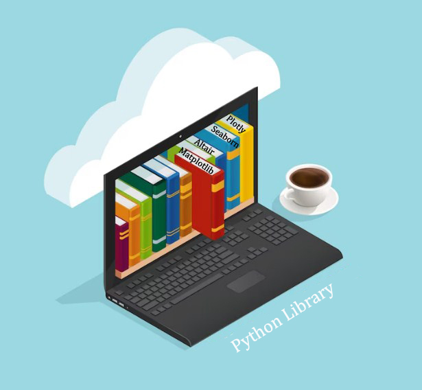
Some of the Python libraries that are popularly used for data visualization
Matplotlib
This library is popularly used to create static, 2D visualizations. It provides several options for building your customizations. You can create data graphics using line charts, bar charts, scatter plots, histograms, and more. This is one of Python’s foundation libraries.
Seaborn
This is based on Matplotlib and uses techniques to beautify and enrich the statistics used to represent data. The use of aesthetically pleasing color palettes in representing the data plots helps to simplify the complexities and makes it enjoyable to browse through. It also adds additional details to the graphs making them both informative and interesting to look at.
Plotly
This library is used primarily to create interactive web-based visualizations. It helps you create interactive charts, dashboards, and maps. The Plotly is ideal for data exploration and presentation.
Bokeh
This library can also be used if you want to add interactivity to your visualizations. Like the Plotly, the Bokeh is also web-based and can be used to create online dashboards with basic code knowledge.
Pandas
This library is used mainly for data manipulation. It can be integrated with matplotlib and Seaborn and is used to perform data exploration and transformation which is a prerequisite for data visualization.
Altair
This library uses the declarative style of designing statistical visualization. Since it does not require coding the specific visualization, it is relatively easy to use this library to create visualizations that are more complex and information-rich. It provides a simple syntax adding to its ease of use.
A blend of Analysis and Visualization
In addition to its vast array of libraries, Python is a preferred choice for data visualization owing to its ability to blend data analysis with visualization techniques. The libraries, Panda and NumPy are built for data manipulation and analysis. Once integrated, you enjoy the ability to perform data analysis and visualization in the same environment.
Customized Support
Python is a highly extensible and customizable programming language. It allows you to customize and modify different aspects of your data plots to create unique visualizations that meet your specific requirements.
Moreover, its extensibility attribute helps in creating customized visualization or even integrating specialized libraries in your environment. This ensures that your data speaks to you in multiple ways to convey unique insights.
Integration with Machine Learning
Machine learning plays a significant role in data visualization. It helps in automating the preprocessing of data before representing them in visual forms and creating interactive dashboards for analysis. Machine learning can also be used to help you visualize model outputs like decision boundaries and prediction probabilities so that you gather an in-depth understanding of the way data models help in making predictions.
Python’s machine learning libraries like Scikit-learn, TensorFlow, and PyTorch can be easily integrated to provide you with the ability to visualize predictive modeling.
Cross Platform Compatibility
Python’s cross-platform compatibility is another feature in its favor for attaining popularity as an aid to data visualization. Python codes written for data visualization can be run on any operating system without requiring any tweaks or modifications. For businesses that work with diverse teams and platforms, this is a bonus.
Making Data build the narrative
While Python helps you build the right visualization technique, you must understand how to make your data work for you using these techniques. Consider the two critical factors.
Build your story
Ensure that in your bid to get interactivity and sophisticated visual models, you do not miss out on building the narrative. Organize your data in the right logical sequence so that the storyline appears organic and not stilted. Your data should be able to walk your users through the introduction, climax, and resolution of your business lore in the most seamless manner. Ensure that your insights are revealed clearly to your users and leave them with a clear and compelling data-driven story.
Choose the right chart type
Visualizing your data is all about representing it in a visual format. Knowing the right format to choose from the plethora of options is therefore critical to create the right impression. If your visuals are unable to convey the insight you wish your data to deliver, then your visualization exercise is deemed a failure. Keep note of three things that you need to know to choose the right chart type:
- Understand your data well. Identify the category it pertains to, namely, numerical, categorical, or time-series.
- Understand the message you want to convey through your data. For example, comparative analysis of data points, trends over a period, display relationship, ranking of order, and so on.
- Understand the audience you wish to convey the message to.
Tying in all these factors with Python’s strong technology support ensures your business story tops the bestseller charts.


